I decided to use the woven background that I made on the way to creating the one for the Tumbling Blocks. If you want to read about that process earlier this week, you can find them under woven background.
I came across work by Hilary Beattie and thought I might try her concept of silhouettes on a patterned background. However like most of what I do, I never seem to get instructions first or if I have them, I digress right from the beginning. So, I guess you can say that this piece was 'inspired by' Hilary's technique!
Anyway, this was to be a blue journal quilt for Contemporary Quilt's 2013 Journal Quilt challenge. According to my own restrictions, it was also to have a fruit. Blue fruit is a bit limited in scope, so I chose blackberries and the intent was to depict them in deep blue...thinking silhouette.
The rest of the post shows how my intent developed. As Nina-Marie commented on Snowy Night, these are little art studies. You learn by doing, but have a result in the end as well. Sort of sketching with the real thing.
I started with a free photo of a handful of blackberries. Then I cut out all the highlights to make a stencil. At this point I had a foggy idea of giving more definition to a berry silhouette by stenciling highlights.
Sometimes intent gets diverted in the early stages. I started looking for a deep navy fabric that had slight patterning. I had used most of it last week on Snowy Night. I didn't want to cut into my indigo fabric yet. I found a small bit of Val Bennett's hand-dye that I had saved because I really love it. But, as you can see, it barely resembles deep navy at all!
So, I traced round the template and used a silver coloured pencil through the stencil to mark the highlights. Okay, now I realised this is no where near like a silhouette...to get it darker I'd have to do something.
I tested the idea of colouring on the back with a permenant pen which might create a deeper shade without obscuring the patterning in the fabric or obliterating the highlights. It seemed to look like it would work. It was looking interesting with black when I thought I would add just a smidge of colour with purple.
Turn over...
oh...blodges.
Okay, rinse rinse rinse in the sink. some colour comes out. coloured pencil comes out. blodges stay in.
In pressing the colour bleed out onto paper towel, I realise the back is quite nearly the holy grail of blackberry fabric altogether! HA.
So, I turn it over, give it a bit more overall colour including blue. and re-do the highlights on this side!
(That was yesterday's teaser photo.) I also added a bit of definition and did mental high-fives and showed A Certain Young Man who can appreciate these things if you get him in the right mood.
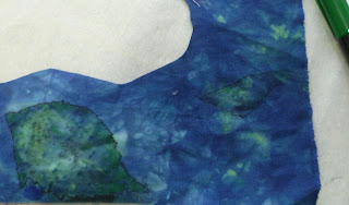
So, now how about leaves? So, there was a bit of green in the mottled blue fabric. I went through the same process for these...including thinking the colour on the back would work for the front. (Slow learner!)
and settling for the back as the front.
In my defense, I will say, I think the 'colour on the back' process might actually work if I am not wanting a dark image. It produced interesting mottled marks. However, the markers do stink! and especially when you press it (between parchment) in hopes the colour is set.
So, from there, I put black Misty Fuse fusible web on the back, checked the positioning on the background, and decided to give the illusion of a still life by quilting the lower portion of the background horizontally. And the upper portion alternating vertical and horizontally giving the suggestion of tiles.
When the quilting was done, I fused the blackberries on, and then stitched into them to adhere further and to give a bit of definition.
A bit of close zig-zag edge on the piece which had been trimmed to A4 size and it is complete!
And I am ahead of the game for Journal Quilts!
and have a mouthwatering desire for Blackberry Cobbler.
I am linking to Nina-Marie's Off the Wall Friday. Check the others out!


5 comments:
Great way to do the berries. Nice job!
Wow Sandy. I love how you did the berries. The final piece reminds me of blueberry ice cream.
ohhh Sandy - these are great! I'm going to be taking some of my studies that I've been collecting and getting them together for a studio night at a friend's studio. We're doing it for the Humane society - plus to get our name out there.
You could really take this in a lot of directions!
Thanks for the comments. I am quite pleased with these myself. and the background colour just sings to me!
Sandy
A lovely rendering of blackberries. They look like they took a lot of patience.
Post a Comment