Monday, 31 March 2014

Embroidered Blouse done.

This is all the story for the review needed for the Fitted Blouse Contest on Pattern Review.

Front

Side

Pattern Description:
Blouse with Double Collar, Double Cuff and Double Placket. Side bust dart, double waist shaping darts in front and back

Pattern Sizing:
UK18

Did it look like the photo/drawing on the pattern envelope once you were done sewing with it?
I made 2 blouses like this before. Previous double collar blouses
However for this one, I added to the side seams and made extra waist shaping darts.

The blouse pattern is based on my own block. The collar, cuffs, and placket are all drafted by a simple rectangle. So, if you have a blouse pattern you like the fit of, you can easily draft rectangles to fit. Then follow instructions for stitching a straight or mandarin collar, etc. If you want a double collar, make it smaller all the way around than the tall one. I went by eye with the rectangles to work out what I thought was a pleasing arrangement.

The outside collar is stitched right sides together on the short sides, turned as you would normally and the raw edge laid against the neckline. It should come a bit short on both ends. (This was done after the button placket of course, so I matched the outside collar to the edge of the outside button placket.) you can machine tack/baste it in place.

Stitch and turn the inside collar and then stitch it to the neckline as if the other was not there. I matched the edges of it to the edges of the inside button placket. It will take a bit of pressing to get the SA to behave, but you can do it!
Detail of double collar, cuff and placket with subtle colour contrast

Were the instructions easy to follow?
I basically followed the same steps as before. However, this time I used a blue cotton as sew-in interfacing on the inside collars, cuffs, and button placket to give a subtle contrast rather than a more obvious contrast in the first blouse.
I like using fabric as a sew-in interfacing because it behaves more like the fabric than manufactured interfacing. In this case, it allows a different look because of the colour of the fabric used under the thin cotton lawn.

It also means you can selectively cut your collar or cuff, etc from fabrics like this embroidered one. I used this characteristic for the cuff. The motifs I chose to 'fussy cut' from the fabric were on the bias, but using a woven fabric as interfacing makes it behave as if it were cut on the proper grain.

What did you particularly like or dislike about the pattern?
I like the fact that you can play with colours to give a unique look to a blouse.
I will probably let one of the back waist darts out. I am not happy with the look in the photo!
Note to self: take photos of the back more often.
But to be fair, the heavy collar in the front distorts a bit, so when you lift your arm to push the camera timer and then turn around, you are already all out of sorts!

Fabric Used:
Embroidered Cotton Lawn

Pattern alterations or any design changes you made:
Besides the light blue cotton for a subtle touch of colour, I increased the blouse 2cm on front and back at the side seams. Then added another waist shaping dart on both front and back.

I had forgotten that I left out interfacing on the top layers of collar, cuff and placket, and because I used a firm white cotton as sew-in interfacing, these areas are a lot more stiff than the first one. I will have to remember next time because it has caused it to be a bit heavy for the cotton lawn.

Would you sew it again? Would you recommend it to others?
Yes, I would sew it again, but probably go back to one dart for waist shaping as it seems my waist is not as shaped as I thought! LOL

Conclusion:
A lovely blouse for the summer. The colours of the embroidery are not real strong. So it still can read as a white blouse. But they give a delicate interest and make it so I can wear this with blue - skirts or jeans or even brown/tan.
If you can't quite understand the instructions above for the double collar and so on, I am happy to try to explain it better.

Sunday, 30 March 2014

"And the Bead Goes On and on..." 23-29 March

2014 - Week 13 Daily Beads

Continue green flat beads with green seed beads.

no.82


no.83


no.84


no.85


no.86


no.87


no.88


And I just realised I was meant to change part way to Brown flat beads and green seed beads.

But, oh well. I may or may not redo them. See how next week goes.

Saturday, 29 March 2014

Something on Saturday

Some developments around here. Trying to make it so our friend Jan can come in...or at least up to the door. The rock is her 'post rock' when she wants to leave a note, she can't get up to the door in the wheelchair.

We have since got a bit more height and less steep by the door. the aluminium folds up when not needed.

PS It is a lot easier for me to step into the house too. win/win

Friday, 28 March 2014

Horizons

This week the Horizons quilts are on display in Ledbury.
March 24th to 30th 2014 at Weaver's Gallery, Church Lane, Ledbury, HR8 1DW
Open 10am-4pm Free Entry.

This includes my piece Visible Horizon.

Next week they are going to Prague!
April 4th to 6th at the Prague Patchwork Meeting, Prague

Here it is when displayed at Festival of Quilts last year.

And now I have heard that a book has been made of the exhibition! I hope to get one soon.

Thursday, 27 March 2014

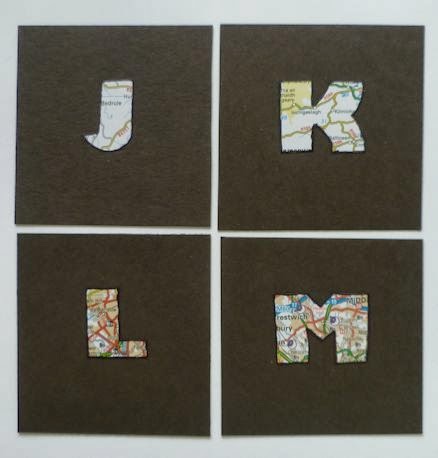
ALAW - J-M -place

March's letters for A Letter A Week.

I decided to hop across to Ireland for the K. I was trying to choose places where the place name was enlarged on the map.

J-Jedburgh

K-Killarney

L-London

M-Manchester

and on the reverse

For some reason these all seem a bit blurry. Sorry. (but I do have a headache, so that might have had something to do with the photo taking.)

Tuesday, 25 March 2014

Embroidered Cotton Lawn

Last year when I went with the Offcuts sewing group to Goldhawk road, I found some lovely embroidered cotton lawn.

So, that is what I am working with this week. I will be making a fitted blouse which I hope to enter into the advanced category of the Fitted Blouse Contest at Pattern Review. You can read the rules here.

I have got it to the place where the darts are sewn and the sides and shoulders machine tacked so I can check the fit in the morning.

It isn't really about the competition so much as using as a motivation to get sewing on blouses again. As you might have guessed, I'd rather just sew another skirt! But you do need to have some blouses, too. This colour will go with my various blue skirts, and even a brown one I have. But it will also go with jeans as well.

I am going to try to do a subtle interest feature with the collar, cuffs and button stand, but hold that thought for now while I try to make sure I have a good fit. Not soo easy to do on your own. Usually I don't work so hard for extreme fit preferring a bit of ease for comfort, but these ladies at Pattern Review make a science of it! So although I know what I am doing, I do feel a bit intimidated.


**********
By the way, you should check out the garments the ladies made who were in the New-to-me pattern contest I was managing during the past month or so. The gallery can be accessed by this link.

Monday, 24 March 2014

Board Shorts - 1 cont.

I finished the shorts. There are plenty of things I want to do differently.

One of the strange things about the facing on the waist is that each piece was meant to be added to the panel and then the seam for the panel and the facing were sewn all in one go...then turned down later.

So, my idea of adding elastic by stitching it to the seam allowance? not possible.

So I stitched it to the facing and then had to stitch the facing near the bottom to the side seams and so on in order for it not to flop up.
The result is okay, but not very easy to do and not really the result I want to put my name to.
Easily fixed for next time though, by doing the facing the normal way of stitching facing pieces together and adding to the waist. It means the waist seam allowance is continuous and the elastic will be able to be stitched to it.

I also had to add a hook and eye to the zip shield to keep the tension of the elastic from pulling the fabric back to reveal the zip. So, I will adjust the fly opening. I may even add the patterns together so that it is a grown on fly shield. at the end of the day, it will be one less fiddley bit.

But oh well, someone will be glad to wear them!

Sunday, 23 March 2014

"And the Bead Goes On and on..." 16-22 March

2014 - Week 12 Daily Beads
the main changes continue to be the type and colour of bead used next to the bone bead.

...continue using shell sequins from last week.

no.75


no.76


no.77


Change back to using the South American flat beads...green with green seed beads.
no.78


no.79


no.80


no.81


Saturday, 22 March 2014

skateboarder jeans to practical waistcoat

Lately through the winter I have been using a fleece gilet over all my other layers to keep warm. (I feel the cold badly and especially in my back).

Now that spring has come to England, I can begin to believe that it might get warm. So, sometimes the fleece gilet will be too warm. However, there will be times when my back still wants some protection.

So, I decided to make a denim waistcoat which might serve the same purpose. (Even when it is hot in August at the Festival of Quilts, sometimes the air conditioning can be a problem.)

I rummaged through my box of 'reserved for refashioning' jeans and denim items. I decided on these skateboarder jeans from back in the day when a Certain Young Man was into skateboarding with his friends.
The denim is quite a heavy weight, so I thought it would help to keep the shape and not just flop about.

You may remember when I made a skirt from a few pairs of trousers and I ended up with problems where the knees had been. It gave a strange shape to the skirt.
(still trying to work out the ideal solution for that.)

Well, this time I tried to avoid that area, but because of random pockets around the knee area of the back of the leg, it wasn't going to work. So, I thought I would use the stretched out area to advantage by cutting the fronts of the waistcoat so that those areas would be in the bust area. I planned to use a side dart anyway, but then the stretched out character would cause the fabric to mould around the bust more like softer fabrics would do.
Also because I didn't intend to fasten this waistcoat anyway, and because of the amount of useful fabric due to the pockets on the jeans, I narrowed the fronts. This will still allow my blouse fabric to be the feature and the waistcoat to serve more like a frame works for paintings than being the feature of what I am wearing.

One of the feature pockets
After I stitched the waistcoat's main seams and top stitched them like a false flat fell seam, I cut out some of the features of the jeans like the pockets and put them on the front. I sewed them on in such a way that there is actually an extra pocket between the cut out pocket and the fabric of the waistcoat.

I did cut the front so there was a bit of a lapel, so I cut facings from the scraps and stitched them on. I turned under all the edges and trimmed so they wouldn't fray.

And here we are!
No photos of the back because it is plain.

Now that I have done this one, I may look at the idea of doing a few more, but with an armscye princess style instead of side dart. This would give the option of using different shades of jeans or even to showcase another interesting fabric. If I do another plain one, I could then find ways to do some stitching or surface design work onto it.

(In what lifetime?)

Oh, by the way, what about the fading on the knees which are now in the bust area? Well, I thought of that. It wasn't too bad, but I worked into it with the colour pencils I use for some of my textile art. I blended it with water and then heat set it. It makes it just enough darker that it doesn't stand out as being exceptionally faded.

Friday, 21 March 2014

Board Shorts - 1

Among the many things I have been doing the last few weeks besides running up and down to London and minding the New-to-me-Pattern company contest on Pattern Review was finally having a go at the Board Shorts pattern I hope to use to make up several pairs of shorts to send to Ethiopia. As you may remember, I have sent skirts off for the girls, but now I want to do some things for the boys.

I was gifted this Jalie pattern not long ago.
For the first one I thought I would try to make it like the pattern says. (Very hard for me!)

However, I decided to definitely deviate from the idea of Velcro fly fastenings Smiley to a zip. I also left off the little inside coin pocket and the little tie adjustment tabs for now.

The side panels are meant to be colour blocked. So, immediately after realising I hadn't fussed about stripe matching when I cut it, I decided to tape the side pieces together and future models, if colour blocked, will only have it in the different panels. However, I had got on a roll when I cut this first one and had cut 2. so...more stripes not matching on the sides. Oh well. I may even try to adapt this panel to include a large pocket for stones and other things boys need to carry around.

I haven't sewed from a pattern I didn't draft (or use pattern drafting software) for about 15 years. This pattern is one where you have to trace the size you want from nested patterns for a very wide range of sizes. I chose to do a size 10, as it was nearer the measurements I am going by. It wasn't too difficult, but all the patterns are on the one sheet, front and back, so you need a large space to do the tracing. I used my dot and cross pattern paper I purchased when I finished C+G.

If you look at the photo above, you can see the pattern also had only illustrations to follow for the directions. Not too much of a problem, but you really have to look at the illustration for things like what the notches look like to work out which pieces to sew together. So, cue unpicking the zip area of the front because I mistook it for the back in the illustrations. (That was when I was still worrying about doing it 'right'.) Some of the other steps required talking it out loud to my friend Pat to work out what it wanted me to do.

Eventually, I got the shorts to the place where they need hemming and that is where they are now.


I was sort of sewing these along with the contestants in the New-to-me-Pattern company contest (I couldn't enter because I was managing it.) However, I have decided to put wide elastic in the back section in order to make it more adjustable for my friend when she tries to work out which child needs them the most. I will sew it to the seam allowance under the facing.

Perhaps I can do that tomorrow and clear the table for the next major project. (I have been working in a small space on the table about 24in square while these different shorts bits and other things are encroaching further and further!)

and for future pairs, I will pick and choose from the instructions and change to methods I decide will work best for the function I intend for the shorts. As you can see, they aren't made up from fabric meant for surfing anyway.

Thursday, 20 March 2014

Halfway Between - TVCT - 4

More of the photos of our exhibition at the Spring Knitting and Stitching Show.

As I said, I couldn't get good photos of it all, but I hope to get down to the National Needlework Archive to get good photos of the rest.

Delia Salter 'View from the Bridge'.
Deila's work at first looks like abstract marks. You read the title and suddenly you realise you are looking down into swirling water!
She says; 'From a bridge that links one side to another you are halfway between, not quite in one place or in the other. From the solidarity of a bridge to the precariousness of the water, you are halfway between the two conditions.'

Mavis Roles' work 'Seeds of Compromise' at first catches the eye with the lovely flowers. Then you begin to see what is around and you realise you are looking at No Man's Land. You think red=poppies and then you catch the clever statement Mavis makes by choosing to use an Honesty Plant instead.
Very thought provoking.

Sheila Dunscombe - 'Mediaeval Grids' inspired by mediaeval paving tiles and the backward text found on some because they were cut by illiterate workers who didn't know which way letters faced.


Several of the rest are linked to thoughts of the times between night and day.

Frances Self - 'Dusk, Darkness and Dawn' An interesting triptych.
Frances says; 'This piece was inspired by images and experiences dealing with a long stay in hospital with a critical illness. Dusk is the uncertainty of diagnosis. Darkness represents an endless stay in ICU. Dawn is the realisation of a future.'

She shared with us that at times, the view of a tree from her window was the only thing to give her hope. You can't tell from this photo, but the centre black portion has the main part of the tree quilted into it. You can see the branches spreading to either side.

Kate Findlay -'Pink Dawn' - inspired by thoughts about Dawn and Dusk, those rather mysterious states in between day and night. As I mentioned before, this piece has fibre optics included.
Kate says; 'Adding lines of light, which change colour slowly, gives a wonderful atmospheric effect in a room with low-level lighting, and it is very soothing to watch.'

Vivian Grant's work was a similar theme. 'Dawn', inspired by thoughts of a night going through the transitional stages towards daylight, with dawn coming
halfway between night and the expectation of what the day will bring.

While Gill Knight's - 'Sunset into Night', inspired by images from contemporary art from the Middle East, focusses on the other end of the day.


Also on one of the outside walls -
The large piece is one of Kate Findlay's pieces from her Hadron Collider series.
We had thought we would have a much smaller space and that another stand would be joined onto ours. So, when we found we had the outside back wall to fill as well, we called on Kate!
But the space was just right for hanging Ruth Archer's piece 'Between the Two Moons' with Kate's. The two 'spoke to each other' in a visual and thematic sense.

And finally, you may recognise the Cloud Puppy. I actually made him for this Halfway Between Challenge, but when our deadline was postponed, I took the opportunity to submit it to Festival of Quilts last year.
This is the statement I included. 'My piece is halfway between imagination and reality. Inspired by an Oriental creature. To me he looked like a puppy made
of clouds. I thought he would be great depicted playing in the wispy atmosphere of an imaginary planet. This is one of my series of ‘Fire Creatures’, making imaginary beings reality.

To see all the works in person, visit the National Needlework Archive in Newbury (Greenham Common). They are on exhibition from 19th March – 30th April. Check the website for opening times. I think it is only open on weekdays, with the only Saturday opening being the 5th April.

These posts about Halfway Between have been added to Off the Wall Friday at Nina-Marie's. If you have come from there, continue to scroll down and see more of the work in our exhibition.

Wednesday, 19 March 2014

Halfway Between - TVCT - 3

A few more photos of the TVCT exhibition at Knitting and Stitching last week.

The first exhibition we did had quite a few 3D items to display on plinths. This time there weren't so many. Here are a few of the small ones.

This book 'Lost' is by Ros Crouch.
We chose to display it in a star shape, but it would also work to have the pages together showing the layers which work together to illustrate the feeling of being lost.
The text on the pages are lines from Dante’s Inferno which describe being lost at the middle of his life in a dark wood.

I wasn't able to get a close up of the other work (had jobs to do!) But here is a photo showing them in the centre of the room.

Besides Ros' book, to the right is Annie Hamilton's book 'Halfway Between Reality and Fantasy'. She enhanced her sketches of a wood near her home. Annie says 'By looking very closely at small areas of the ground, I could make out leaves, twigs, plant and small dark spaces that seemed to form odd creatures.'

and in the front is Clare William's 'Imaginarium' which she describes as a travelling theatre with the quote ‘An imaginarium is a place to go for your imagination – to let it flower, let it grow, let it take you places.’

These small pieces on the plinths were near to the centre of the room, but worked well visually with the 3 pieces behind them. The work seen on the wall in the photo above were inspired by various aspects of water and used shibori fabrics and natural dyeing techniques.
From left to right:
Margaret Ramsay - 'Fleet Mudflats' part of a seascape series exploring rhythm and referencing the transitional intertidal zones of the Fleet. She also blended inkjet images of indigo shibori fabrics and photos of sand ripples, then altered them to look like the genuine article.

Cathy Park - 'Sky, Sea, Shore' Cathy had fabric she had dyed with indigo and potassium permanganate. To her, they were 'halfway between what I wanted and what I liked.' I think that together they work well to be just right!

Marion Robertson - 'Rock Pools at Nairn'. Marion chose a part of the beach where there are rock pools because of the happy memories of playing there as a child, and also of her children playing there. She says, 'For me the rock pools are neither land nor sea but sometimes they are both.'

Marion has been giving valuable help with the admin side of the exhibition. She also spent a great deal of time putting together inspiration packs which we were able to sell to help cover exhibition costs.

And finally for 3D work.
I didn't get a photo of Dorothy Crossley's piece 'Cannock Chase' on its own. It was wonderfully textured and when it was hung away from the wall the shadows behind added even more to the depth which was already in the work. Dorothy's inspiration for her woven tapestry came from her walks on Cannock Chase. She says, 'The viewer is encouraged to enter the environment and look to see what is between the trees.'
You can see Dorothy's piece on the wall in this photo.
The work in front of Dorothy's piece was made by Jane Glennie.

Jane submitted two very different pieces. One very large and one very small.
Jane used a scaled up knitting process with recycled video tapes to create her large piece, 'Two Trunks'. The two textured, thin, iridescent black structures were influenced by the trunks of pines in Swinley Forest, Berkshire after the recent forest fire. She asks, 'Are the trunks living or dead? They are somewhere halfway between. If dead themselves, they are supporting visible life in the form of moss and lichen.'

Unfortunately I didn't get a photo of the small one. It was rather fragile, so she waited to the beginning of the opening day to take the little porcelain pieces out of their wrappings. As I said, at that point, I totally forgot to take any more photos.

A few more photos tomorrow.